Thursday, November 19, 2020

How To Trade The Forex Market Using Fibonnaci


Fibonacci is a huge subject in the world of trading. We have different Fibonacci ratios ranging from Fibonacci Retracement, Fibonacci Extension, Fibonacci Fan, Fibonacci Arcs, Fibonacci Time zones. But for the sake of simplicity, we would be dealing with just the retracement. 

A lot of traders use the Fibonacci retracement levels as potential support and resistance areas. Since so many traders watch these levels in order to place buy and sell orders, this makes the support and resistance levels tend to become a self-fulfilling prophecy.

Most charting software comes with the Fibonacci retracement level tool. In order to apply Fibonacci levels to your charts, you'll need to identify Swing High and Swing Low points.


Fibonacci Retracement

The first thing you should know about the Fibonacci tool is that it works best when the market is trending. 

The idea is to buy on a retracement at a Fibonacci support level when the market is trending up, and to sell on a retracement at a Fibonacci resistance level when the market is trending down. 

In order to find these retracement levels, you have to find the recent significant Swing Highs and Swings Lows.

In order to plot it in a downtrend, you would have to click on the Swing High and drag the cursor to the most recent Swing Low and for an uptrend, you would do the opposite. Click on the Swing Low and drag the cursor to the most recent Swing High. 

Let's take a look at some examples of how to apply Fibonacci retracements levels in the markets. 

Uptrend Scenario.

Here we plotted the Fibonacci retracement Levels by clicking on the Swing Low and dragging the cursor to the Swing High. The software now shows you the retracement levels which are 

As you can see from the chart, the retracement levels were 23.6%, 38.2%, 50.0%, 61.8% and 76.4%. 

Now, the expectation is this pair retraces from the recent high, it will find support at one of those Fibonacci levels because traders will be placing buy orders at these levels as the price pulls back. 

Let's take a look at what happened afterward in the image below.


Price eventually pulled back right through the 23.6% level and continued to move down until it tested the 38.2% level but was unable to close below it. The market resumed its upward move and broke through the swing high. Clearly, buying at the 38.2% Fibonacci level would have been a profitable trade!

Downtrend Scenario


Here we plotted the Fibonacci retracement levels by clicking on the Swing High and dragging the cursor to the Swing Low. The software now shows you the retracement levels.

The expectation for a downtrend is that if price retraces from this low, it will encounter resistance at one of the Fibonacci levels because traders will be ready with sell orders there.

Let's take a look at what happened next. 


Price started moving up after the low and broke the 23.6% level into the 38.2% level, then made a slight break there and did as if it wants to come up but eventually went down breaking the 38.2% into 50.0% and broke that level also.

Finally, it was held at the 61.8% level and started an upward move from there which saw the price moving back to the lowest point and breaking past the 0.0% going further down. Clearly a very profitable trade there.

In these two examples, we see that price have a way of pausing at each level making it temporary support or resistance before breaking through that level or retracing back from that level. Because of all the people who use the Fibonacci tool, those levels become self-fulfilling support and resistance levels. 

One thing you should take note of is that price won't always bounce from these levels. They should be looked at as areas of interest.

There is a clause you should always remember about using the Fibonacci tool. The clause is simple; fib level fails at times also just like every other support and resistance indicator. So let’s take a look at scenarios when it fails.

When Fibonacci Fails

Their golden rule of support and resistance with other forms of trading indicators is that they hold at times and they fail at times.  This is why traders need to think in terms of probabilities.

Now, let's go through an example when the Fibonacci retracement tool fails.

The image below is that of a pair that had seen a downward trend. The Fibonacci approach to this is to look for a possible retracement when this pair starts heading up so we can get in on a good level and follow it back down hoping that one of the fib levels will act as a resistance to the uptrend.

So we bring out our Fibonacci tool and draw in from the high of the swing to the low of it like you can see on the chart.   


You can see on the chart that price first made a slight stop on the 23.6% then broke up to the 50.0% level. It dropped down a little bit from there then pushed up above the 61.8% level and we see it go up to the 100.0% and broke it upwards without even considering that level.

Assuming we placed a sell order at 23.6% or 50.0% level because of the way price behaved at those levels, we would have ended up with losing trades. It wasn’t a wrong decision; the price just didn’t respect those levels in this scenario.

The reason for this is because; traders look at charts differently, look at different time frames, and have their own fundamental biases. So a level that might appear as resistance on a smaller timeframe might actually be a support on a larger or a different timeframe.

That's why you need to hone your skills and combine the Fibonacci indicator with other indicators in your Forex toolbox to help give you a higher probability of success.  You can’t rely on only one indicator.

Click here to go to the next lesson.

Click here to go to the previous lesson

Go back to the indicator list.

How To Trade The Forex Market Using Average Directional Index


The Average Directional Index, or ADX for short, is another example of an oscillator. It fluctuates from 0 to 100, with readings below 20 indicating a weak trend and readings above 50 signaling a strong trend. 

Unlike the stochastic, ADX doesn't determine whether the trend is bullish or bearish. Rather, it merely measures the strength of the current trend. Because of that, ADX is typically used to identify whether the market is ranging or starting a new trend. 

Take a look at these neat charts we've pulled up:


In this first example, ADX lingered below 20 within the spaces colored blue. Price just couldn’t move aside of the ranging formation. The ADX readings below the 20 is doing a great job letting us know there is no trend in sight.

However, in the next color red section, you can see that the ADX below climbed above 50, signaling that a strong trend could be waiting in the wings.

And true to that, we can see a beautiful downtrend with so many profits to pick from.  Perfectly obeying the readings of the ADX signaling strength in price movement


Now, let's look at another example:


With a perfect similarity to the initial example we treated, ADX lingered around the 20 levels for quite a while. At that time, the price on the chart was also ranging. After a while, ADX rose above 50 and the price also broke out from the range and headed upwards. 

It’s obvious we can see an uptrend when the ADX went to the 50 level. That’s an amazing profit to lock into your trading wallet.

Now the little twist to ADX unlike other oscillators is the fact that it doesn’t exactly tell you whether it's a buy or a sell. What it does tell you is whether it'd be okay to jump in an ongoing trend or not. 

Once ADX starts dropping below 50 again, it could mean that the uptrend or downtrend is starting to weaken and that it might be a good time to lock in profits. 


                                                       How to Trade Using ADX

One way to trade using ADX is to wait for breakouts first before deciding to go long or short. ADX can be used as confirmation whether the pair could possibly continue in its current trend or not. 

Another way is to combine ADX with another indicator, particularly one that identifies whether the pair is headed downwards or upwards. 

ADX can also be used to determine when one should close a trade early. 

For instance, when ADX starts to slide below 50, it indicates that the current trend is losing steam. From then on, the pair could possibly move sideways, so you might want to lock in those pips before that happens.

Click here to go to the next lesson. 

Click here to go to the previous lesson

Go back to the indicator list.

Monday, November 16, 2020

How To Trade The Forex Market Using Relative Strenght Index


Relative Strength Index (RSI) shares similarities with other oscillators because it is designed to identify overbought and oversold conditions in the market. It is also scaled from 0 to 100. Typically, readings below 30 indicate oversold, while readings over 70 indicate overbought. 


How to Trade Using RSI

The RSI can be used just like other oscillators. Its primary purpose is to pick the potential tops and bottoms price movement. This is determined by using its overbought and oversold readings

We take a look at the chart below to see RSI in action.


Going through the chart above, you can see price trading up in the red rectangle. While price was moving in that direction, RSI moved above the 70 line signaling an overbought which also means we are running out of buyers in that uptrend move. Eventually, you can see that price fell at the oversold reading of RSI.

The reverse scenario took place at the rectangle marked blue. RSI gave an oversold reading as it touched the 30 level. Shortly after, the market ran out of sellers and price made a move for the upside. This is an indicator that when RSI is on the extreme, we should be getting set for a possible reversal move.


Determining the Trend using RSI

RSI is a very popular tool because it can also be used to confirm trend formations. RSI is one of the most widely used trading indicators by professional traders just like stochastic and MACD.

One of its beauty is the fact that it can be used to determine if a trend is forming in the market. As traders, we want to always be on the side of the trend and join the move.

Aside the overbought and oversold levels of 70 and 30, a reading of 50 crossing to the upside or to the downside can be of great use to gauge the start of a trend. The 50 line is not highlighted on the indicator software by default; you have to manually put it there by yourself.

If you are looking at a possible uptrend, then make sure the RSI is above 50. If you are looking at a possible downtrend, then make sure the RSI is below 50.

You can see as the crossing of RSI on the 50 confirmed a trend. This also applies if we looking for a downtrend.

Click here to go to the next lesson.

Click here to go to the previous lesson

Go back to the indicator list.

How To Use Stochastic Indicator In Forex Trading


The Stochastic is another indicator that helps us determine where a trend might be ending. The stochastic has two lines that cross each other to give a sell or a buy signal.

By definition, a Stochastic is an oscillator that measures overbought and oversold conditions in the market. In a market trending up, prices close near the high, and in a market trending down, prices close near the low.  


How to Trade Using the Stochastic

The Stochastic is scaled from 0 to 100 and like earlier established, it tells us when it thinks the market is probably overbought or oversold.

When the Stochastic lines are above 80 (the overbought dotted line in the chart above), then it means the market is overbought. When the Stochastic lines are below 20 (the oversold dotted line), then it means that the market is oversold. 

As a rule of thumb, we buy when the market is oversold, and we sell when the market is overbought. 


Looking at the chart above, you can see that the Stochastic showed overbought when it crossed that dotted line above, based on this, if you sold the pair from there, your decision would be accepted as good because after then, the price started going down, in other words when the price is overbought, sooner or later a reversal move will take place.


The same is true when stochastic shows an oversold reading.  If you bought the pair after an oversold reading, chances are high you would catch the bull run that proceeds after the oversold reading. The chart above explains it. 

Click here to go to the next lesson.

Click here to go to the previous lesson

Go back to the indicator list. 

Saturday, November 14, 2020

How To Trade The Forex Market Using Parabolic SAR


One indicator that can help us determine where a trend might be ending is the Parabolic SAR (Stop And Reversal). A Parabolic SAR places dots, or points, on a chart that indicate potential reversals in price movement.

Although it is important to be able to identify new trends, it is equally important to be able to identify where a trend ends. A well-timed exit is as important as a well timed entry. 


How to Trade Using Parabolic SAR

The nice thing about the Parabolic SAR is that it is really simple to use. Trading with this indicator is about the simplest approach you can have in your world of trading.

Basically, when the dots are below the candles, it is a buy signal; and when the dots are above the candles, it is a sell signal. 


The image above is quite simple and that’s basically what parabolic is all about. 

When the first dot appears below the price, it assumes that the price is going up and when the first dot appears above the price, it assumes that the price is going down. With this established, this tool is best used in markets that are trending, and that have long rallies and downturns. 

This indicator would not favor your trade decisions when it’s used in a choppy market where the price movement is sideways.

Using Parabolic SAR to exit trades

 You can also use Parabolic SAR to help you determine whether you should close your trade or not. 

Check out how the Parabolic SAR worked as an exit signal in the chart below.


When the green dot appeared at the spot(parabolic SAR) the arrow pointed at in the image above, the circled price level (candle) indicates when we are supposed to sell that pair, and when the other green dot(parabolic SAR) came up under the price, that was the spot to exit that sell position.

If we kept holding on to that sell position after that green dot (parabolic SAR) had appeared under price hoping the price will continue going down, all the profits we have accrued will be eroded because the trend reversed and moved against us from there. 

Click here to go to the next lesson.

Click here to go to the previous lesson

Go back to the indicator list. 

Monday, October 5, 2020

How To Trade The Forex Market Using MACD


MACD is an acronym for Moving Average Convergence Divergence. This indicator is used to identify moving averages that are indicating a new trend, whether it's bullish or bearish. Every trader’s top priority is being able to find a trend because that is where the most money is made. 


Question is:  How did they come about the name Moving Average Convergence Divergence?

Let’s start by explaining the concept behind this indicator.

When you load up a MACD indicator on your trading chart, you will usually see three numbers that are used for its settings.

• The first is the number of periods that are used to calculate the faster-moving average.

• The second is the number of periods that are used in the slower moving average.

• And the third is the number of bars that are used to calculate the moving average of the difference between the faster and slower moving averages. 

For example, if you open a MACD on your charting software, the parameters you would see are "12, 26, 9".  This is how you would interpret those numbers:

• The 12 represents the previous 12 bars of the faster-moving average.

• The 26 represents the previous 26 bars of the slower moving average.

• The 9 represents the previous 9 bars of the difference between the two moving averages. This is plotted by vertical lines called a histogram.

The two lines that are drawn are NOT moving averages of the price. Rather, they are the moving averages of the DIFFERENCE between two moving averages.  

In the example above, the faster moving average is the moving average of the difference between the 12 and 26-period moving averages.

The slower moving average on the other hand plots the average of the previous MACD line. Once again, from our example above, this would be a 9-period moving average. 

This means that we are taking the average of the last 9 periods of the faster MACD line and plotting it as our slower moving average. This smoothens out the original line even more, which gives us a more accurate line.

The histogram simply plots the difference between the fast and slow moving average. If you look at the chart, you can see that, as the two moving averages separate, the histogram gets bigger. 

This is called divergence because the faster moving average is "diverging" or moving away from the slower moving average.

As the moving averages get closer to each other, the histogram gets smaller. This is called convergence because the faster moving average is "converging" or getting closer to the slower moving average. 

 Using The MACD

Because there are two moving averages with different "speeds", the faster one will obviously be quicker to react to price movement than the slower one. 

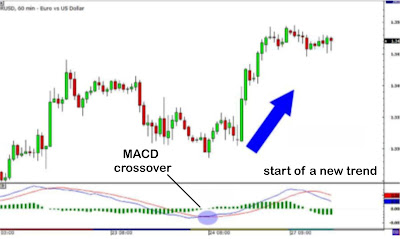
When a new trend occurs, the fast line will react first and eventually cross the slower line. When this "crossover" occurs, and the fast line starts to "diverge" or move away from the slower line, it often indicates that a new trend has formed.


From the chart above, you can see that the fast line crossed under the slow line and correctly identified a new downtrend. Notice that when the lines crossed, the histogram temporarily disappears. 

This is because the difference between the lines at the time of the cross is 0. As the downtrend begins and the fast line diverges away from the slow line, the histogram gets bigger, which is a good indication of a strong trend.

Take a look at this chart below.


In the chart above, the fast line crossed above the slow line while the histogram disappeared. This suggested that the brief downtrend would eventually reverse. 

From then on, the price began shooting up as it started a new uptrend. Assuming you bought this after the crossover, you would have made a good number of profits. 

There is one drawback to MACD though. Since all moving average lag behind price, because they calculate the average of historical prices, the same lagging is also expected of the MACD indicator also.

Since the MACD represents moving averages of other moving averages and is smoothed out by another moving average, the lagging is inevitable. However, MACD is still one of the most favored tools by many traders.

Click here to go to the next lesson.

Click here to go to the previous lesson.        

Click here to go back to the indicator list. 


How To Trade Forex Using Bollinger Band


Bollinger bands are used to measure a market's volatility. 

Basically, this little tool tells us whether the market is quiet or whether the market is loud! When the market is quiet, the bands contract and when the market is loud, the bands expand. 

Take a look at the chart below, you should notice that when price is quiet, the bands are close together and when price moves up, the bands spread apart.


The Bollinger band has its own calculations but you actually don't need to bother yourself with any of that.  Knowing how to apply this amazing indicator to your trading is actually more important.

 The Bollinger Bounce

One thing you should know about Bollinger Bands is that price tends to return to the middle of the bands. That is the whole idea behind the Bollinger bounce. By looking at the chart below, you can see that price did two things….

First, it touched the extreme part of the band, and then it went back down to the middle of the band…


The move you saw was a classic Bollinger Bounce. The reason these bounces occur is because Bollinger bands act like dynamic support and resistance levels. 

The longer the time frame you are in, the stronger these bands tend to be. Some traders have developed systems that thrive on these bounces. A strategy like this is best used when the market is ranging and there is no clear trend.

The market also trends, so there are ways to equally trade a trending marketing using the Bollinger band indicator.

Bollinger Squeeze

The Bollinger squeeze is pretty self-explanatory, however when the bands squeeze together, it usually means that a breakout is getting ready to happen. 

If the candles start to break out above the top band, then the move will usually continue to go up. If the candles start to break out below the lower band, then the price will usually continue to go down. 


Looking at the chart above, you can see the bands squeezing together. The price has just started to break out of the top band. Because it is breaking out the top band, the possibility is very high that it will continue going up prompting an upward trend.

That was exactly what it did if you now look at the image below.  


This is how a typical Bollinger Squeeze works. 

This strategy is designed for you to catch a move as early as possible. Setups like these don't occur every day, but you can probably spot them a few times a week if you are looking at a 15-minute chart. 

There are many other things you can do with Bollinger bands, but these are the 2 most common strategies associated with them. This is basically the information you need to start with on Bollinger band and with constant practice with this indicator; you would be able to come up with other unique ways to work with it.

Click here to go to the next lesson

Click here to go to the previous lesson

Click here to go to the list of indicators. 


How To Use Moving Average In Forex Trading


A moving average is simply a way to smooth out price action overtime.

Like every indicator, a moving average indicator is used to help us forecast future prices. By looking at the slope of the moving average, you can better determine the potential direction of market prices. 

As we said, moving averages smooth out price action. 

There are different types of moving averages and each of them has their own level of "smoothness". 

Generally, the smoother the moving average, the slower it is to react to the price movement. 

The choppier the moving average, the quicker it is to react to the price movement. To make a moving average smoother, you should get the average closing prices over a longer time period.  

In this section, we first need to explain to you the two major types of moving averages:

1. Simple

 2. Exponential

It’s important you know how to calculate them and give the pros and cons of each. It’s of great benefit for you to know the basics first.  

So let me dive into it right away.


Simple Moving Averages

A simple moving average is the simplest type of moving average.

Even though you won’t be needing to calculate what I am about to explain now because the software will automatically do that for you, I just want to give you a heads up so you know what is happening behind the software when you plot it on your chart.

 Here we go..

A simple moving average is calculated by adding up the last "X" period's closing prices and then dividing that number by X. 

Lost?

Just read along.

IMAGE OF WHAT A MOVING AVERAGE LOOKS LIKE ON A CHART.

If you plotted a 5 period simple moving average on a 1-hour chart, you would add up the closing prices for the last 5 hours, and then divide that number by 5. Voila! You have the average closing price over the last five hours! String those average prices together and you get a moving average!

That’s what it does.

If you were to plot a 5-period simple moving average on a 10-minute chart, what the software does is to add up the closing prices of the last 50 minutes and then divide that number by 5. 

If you were to plot a 5 period simple moving average on a 30 minute chart, the software adds up the closing prices of the last 150 minutes and then divides that number by 5.

If you were to plot the 5-period simple moving average on the 4 hr, the software adds up the closing prices of the last 20hours and then divides that number by 5.

You get the picture!

All Forex platforms will do the calculations for you. The reason I explain it as background information is for you to understand so that you know how to edit and tweak the indicator when you start using it.

Understanding how an indicator works means you can adjust and create different strategies as the market environment changes. 

Now, just like almost any other indicator out there, moving averages operate with a delay. Because you are taking the averages of past price history, you are really only seeing the general path of the recent past and the general direction of "future" short term price action. 

Here is an example of how moving averages smooth out the price action


On the chart above, I plotted three different Simple Moving Averages on the chart. 
The longer the SMA period is, the more it lags behind the price. 

Notice how the 50 SMA is farther away from the current price than the 20 and 10 SMAs. 

This is because the 50 SMA adds up the closing prices of the last 50 periods and divides it by 50. The longer period you use for the SMA, the slower it is to react to the price movement. 

The SMAs in this chart shows you the overall sentiment of the market at this point in time. Here, we can see that the pair is trending. 

Instead of just looking at the current price of the market, the moving averages give us a broader view, and we can now gauge the general direction of its future price. With the use of Simple Moving Averages, we can tell whether a pair is trending up, trending down, or just ranging. 

There is one problem with the simple moving average and it's that they are susceptible to spikes. When this happens, this can give us false signals. We might think that a new trend may be developing but in reality, nothing changed.

Let’s take a look at another type of moving average.

Exponential Moving Average

So while the simple moving average places emphasis on the closing of prices which makes it a bit slow but gives us the general trend, the exponential moving averages (EMA) give more weight to the most recent periods. It puts more emphasis on what traders are doing recently. 

Let's take a look at this chart to highlight how an SMA and EMA would look side by side on a chart.


 Notice how the red line (the 50 EMA) seems to be closer to the price than the blue line (the 50 SMA). This means that it more accurately represents recent price action.

It's because the EMA places more emphasis on what has been happening lately. When trading, it is far more important to see what traders are doing at the moment rather than what they were doing last week or last month.

 SMA vs. EMA

Let me quickly explain the difference between the two.

First, let's start with the exponential moving average. When you want a moving average that will respond to the price action rather quickly, then a short period EMA is the best way to go. 

These can help you catch trends very early, which will result in higher profits. In fact, the earlier you catch a trend, the longer you can ride it and rake in those profits.

The downside to using the exponential moving average is that you might get faked out during consolidation periods. 

Because the moving average responds so quickly to the price, you might think a trend is forming when it could just be a price spike. This is because the indicator is just too fast.  

With a simple moving average, the opposite is true. When you want a moving average that is smoother and slower to respond to price action, then a longer period SMA is the best way to go. 

This would work well when looking at longer time frames, as it could give you an idea of the overall trend.

Although it is slow to respond to the price action, it would do well in saving you from many fake outs. The downside is that it might delay you too long, and you might miss out on a good entry price or the trade altogether.

 So which one is better?

This is left to the trader to decide based on what they want to see in the price.

Traders plot several different moving averages to give them both sides of the story. They might use a longer period simple moving average to find out what the overall trend is, and then use a shorter period exponential moving average to find a good time to enter a trade. 

There are a number of trading strategies that are built around the use of moving averages. I will be taking a look at these in the following lessons.

I will teach you on:

1. How to use moving averages to determine the trend

2. How to incorporate the crossover of moving averages into your trading system

3. How moving averages can be used as dynamic support and resistance

 Using Moving Averages

One sweet way to use moving averages is to help you determine the trend. 

The simplest way is to just plot a single moving average on the chart. When price action stays above the moving average, it would signal that price is in a general uptrend. 

If price action stays below the moving average, then it would indicate that it is in a downtrend

 What the majority of traders do - and what I suggest you do as well - is that they plot a combination of moving averages on their charts instead of just one. This gives them a clearer signal of whether the pair is trending up or down depending on the order of the moving averages. 

Let me explain. 

In a downtrend, the "faster" moving average should be below the "slower" moving average and for an uptrend, vice versa. For example, let's say we have two SMAs: the 20-period SMA and the 100-period SMA. On your chart, it would look like this:


Moving Average Crossover Trading

By now, you know how to determine the trend by plotting on some moving averages on your charts. You should also know that moving averages can help you determine when a trend is about to end and reverse. 

All you have to do is to load up a couple of moving averages on your chart and wait for a crossover. If the moving averages cross over one another, it could signal that the trend is about to change soon, thereby giving you the chance to get a better entry. By having a better entry, you have the chance to profit from the trade.


Note, when price is trending downwards or upwards for an extended period of time, you would make money using the moving average crosses has your entry points. But when the price is trending sideways which we get to experience sometimes, then the crosses won’t be effective because you would experience multiple crosses that won’t lead anywhere.

                          Moving Average acting as Support and Resistance

Moving averages can also be used as a support and resistance level.

Due to the fact that the moving average works alongside the price and not static like your traditional support and resistance, it is referred to as dynamic support or resistance.  They are constantly changing depending on recent price action. 

Some traders look to moving averages as key support or resistance. These traders will buy when the price dips and tests the moving average or sell if the price rises and touches the moving average. 

Take a look at the chart below.

It looks like it held really well! Every time price approached the moving average and tested it, it acted as resistance and price bounced back down.

One thing you should keep in mind is that these are just like your normal support and resistance lines.

There are also times when the price will blast past it altogether and won’t acknowledge the moving average.

 Breaking through Dynamic Support and Resistance

Now you know that moving averages can potentially act as support and resistance. Combining a couple of them, you can have yourself a nice little zone. But you should also know that they can break, just like any support and resistance level! 

Let's take another look at the chart below.


In the chart above, we see that the 50SMA, 100SMA, and 150SMA held as a strong resistance level for a while as price repeatedly bounced off it. 

So there you have it, folks!

Moving averages can also act as dynamic support and resistance levels. 

One nice thing about using moving averages is that they're always changing, which means that you can just leave it on your chart and don't have to keep looking back in time to spot potential support and resistance levels. 

Why don't you open up your charting software and try popping up some moving averages here.  

Remember, using moving averages is easy. The hard part is determining which one to use! 

That's why you should try them out and figure out which best fits your style of trading. Maybe you prefer a trend-following system. Or maybe you want to use them as dynamic support and resistance. 

Whatever you choose to do, make sure you read up and do some testing to see how it fits into your overall trading plan. 

Click here to go to the next lesson.

Click here to go to the previous lesson

Go to indicator list here. 


Friday, October 2, 2020

Understanding Support and Resistance in Forex


Support and resistance is one of the most widely used concepts in trading. It's extremely popular amongst traders. There are several ways to measure support and resistance designed by a lot of traders. Here is a look at the basics.


Look at the diagram above. As you can see, this zigzag pattern is making its way up (uptrend). When the market moves up and then pulls back, the highest point reached before it pulled back is now resistance.

As the market continues up again, the lowest point reached before it started back is now support. In this way, resistance and support are continually formed as the market oscillates over time. The reverse is true for the downtrend.

Plotting Support and Resistance

One thing to remember is that support and resistance levels are not exact numbers. 

Often times you will see a support or resistance level that appears broken, but soon after find out that the market was just testing it. With candlestick charts, these "tests" of support and resistance are usually represented by the candlestick shadows.


Notice how the shadows of the candles tested the support level. At those times it seemed like the market was "breaking" support. In hindsight, we can see that the market was merely testing that level.


So how do we truly know if support and resistance was broken?

There is no definite answer to this question. Some argue that a support or resistance level is broken if the market can actually close past that level. However, you will find that this is not always the case. 

Let's take our same example from above and see what happened when the price actually closed past the support level.


In this case, the price had closed below the support level but ended up rising back up above it. 

If you had believed that this was a real breakout and sold this pair, you would've been wrong.

Looking at the chart now, you can visually see and come to the conclusion that the support was not actually broken; it is still very much intact and now even stronger. 

To help you filter out these false breakouts, you should think of support and resistance more of as "zones" rather than concrete numbers. 

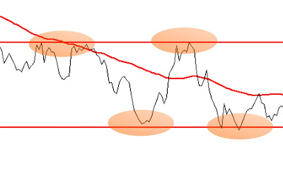
One way to help you find these zones is to plot support and resistance on a line chart rather than a candlestick chart. The reason is that line charts only show you the closing price while candlesticks add the extreme highs and lows to the picture. 

These highs and lows can be misleading because often times they are just the "knee-jerk" reactions of the market.

When plotting support and resistance, you don't want the reflexes of the market. You only want to plot its intentional movement

Looking at the line chart, you want to plot your support and resistance lines around areas where you can see the price forming several peaks or valleys. 

Other interesting tidbits about support and resistance

When the price passes through resistance, that resistance could potentially become support.

The more often price tests a level of resistance or support without breaking it, the stronger the area of resistance or support is.

When a support or resistance level breaks, the strength of the follow-through move depends on how strongly the broken support or resistance had been holding. 


With a little practice, you'll be able to spot potential support and resistance areas easily. Now let’s look at how to draw trendlines.


Trend lines

Trend lines are probably the most common form of technical analysis. They are probably one of the most underutilized ones as well.

If drawn correctly, they can be as accurate as any other method. Unfortunately, most traders don't draw them correctly or try to make the line fit the market instead of the other way around.

In their most basic form, an uptrend line is drawn along the bottom of easily identifiable support areas (valleys). In a downtrend, the trend line is drawn along the top of easily identifiable resistance areas (peaks).

How do you draw trend lines

To draw trend lines properly, all you have to do is locate two major tops or bottoms and connect them. 

Here are trend lines in action! Look at those waves!


Types of Trends

There are three types of trends:

Uptrend (higher lows)

 Downtrend (lower highs)

Sideways trends (ranging)


Here are some important things to remember about trend lines:

It takes at least two tops or bottoms to draw a valid trend line but it takes THREE to confirm a trend line.

The STEEPER the trend line you draw, the less reliable it is going to be and the more likely it will break.

Like horizontal support and resistance levels, trend lines become stronger the more times they are tested.

And most importantly, DO NOT EVER draw trend lines by forcing them to fit the market. If they do not fit right, then that trend line isn't a valid one!


Channels

If we take this trend line theory one step further and draw a parallel line at the same angle of the uptrend or downtrend, we will have created a channel.

Channels are just another tool in technical analysis which can be used to determine good places to buy or sell. Both the tops and bottoms of channels represent potential areas of support or resistance.


To create an up (ascending) channel, simply draw a parallel line at the same angle as an uptrend line and then move that line to position where it touches the most recent peak. This should be done at the same time you create the trend line.

To create a down (descending) channel, simply draw a parallel line at the same angle as the downtrend line and then move that line to a position where it touches the most recent valley. This should be done at the same time you create the trend line. 

When prices hit the bottom trend line, this may be used as a buying area. When prices hit the upper trend line, this may be used as a selling area. 

Types of channels

There are three types of channels:

Ascending channel (higher highs and higher lows)

Descending channel (lower highers and lower lows)

Horizontal channel (ranging)

Important things to remember about trend lines:

When constructing a channel, both trend lines must be parallel to each other. 

Generally, the bottom of the channel is considered a buy zone while the top of the channel is considered a sell zone.

Like in drawing trend lines, don’t force the price to the channels that you draw! A channel boundary that is sloping at one angle while the corresponding channel boundary is sloping at another is not correct and could lead to bad trades.

Trading the Lines

Click here to go to the next lesson

Go back to the indicator page here.